Academic Divisions

Center for Global Affairs (CGA)
Make a difference across a range of international political, economic, and social issues. CGA prepares students and supports professionals in the private, nonprofit, or government sectors. This vibrant international educational community of experts and alumni are connected by their desire to make a significant impact across issue areas like climate, global security, philanthropy, and international relations
Learn More About Center for Global Affairs (CGA)
Center for Publishing, Writing, and Media
The Center supports students as they pursue careers in publishing, writing, translation, and more. From training critical skills to convening top industry experts, we help ensure that you’re ready to find success in your future pursuits. Through our Academy of Lifelong Learning, we offer a catalog of enrichment courses in the arts, humanities, and social sciences.
Learn More About Center for Publishing, Writing, and Media
Division of Applied Undergraduate Studies (DAUS)
DAUS serves a diverse community of undergraduate learners, each with their own needs, goals, and objectives. Our associate’s and bachelor’s degrees build knowledge, critical thinking, creativity, and problem-solving skills, plus specific skills in the disciplines students choose.
Learn More About Division of Applied Undergraduate Studies
Division of Programs in Business
We educate leaders in a range of in-demand areas of business, including marketing and PR, management and systems, human capital, and finance. Our portfolio of graduate degrees and continuing education programs prepare students to drive innovative organizational growth on a global scale.
Learn More About Division of Programs in BusinessMore Academic Divisions

Jonathan M. Tisch Center of Hospitality
The New York City advantage meets global insight. The Tisch Center of Hospitality prepares individuals from around the world for hospitality management, travel, tourism, and event management careers. Known as a premier hospitality school, students will learn from top industry experts, travel and work around the world, and build an invaluable professional network.
Learn More About Jonathan M. Tisch Center of Hospitality
Preston Robert Tisch Institute for Global Sport
Find your place in the center of the global sport management business. Our expert faculty and industry partners prepare students for leadership in all facets of the global sports field—from the impact of the sports economy and management to eSports and digital sports media
Learn More About Preston Robert Tisch Institute for Global Sport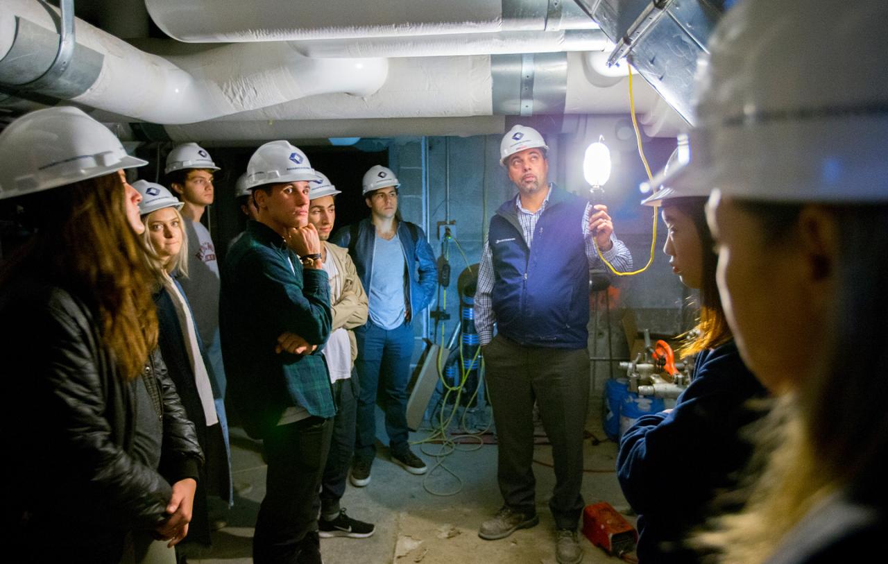
Schack Institute of Real Estate
Learn about the fast-evolving trends affecting the real estate finance, development, and construction markets from the people managing those challenges every day. Students who complete our bachelor’s, master’s or continuing education programs have the skills they need to take their places in jobs across the global real estate industry.
Learn More About Schack Institute of Real Estate